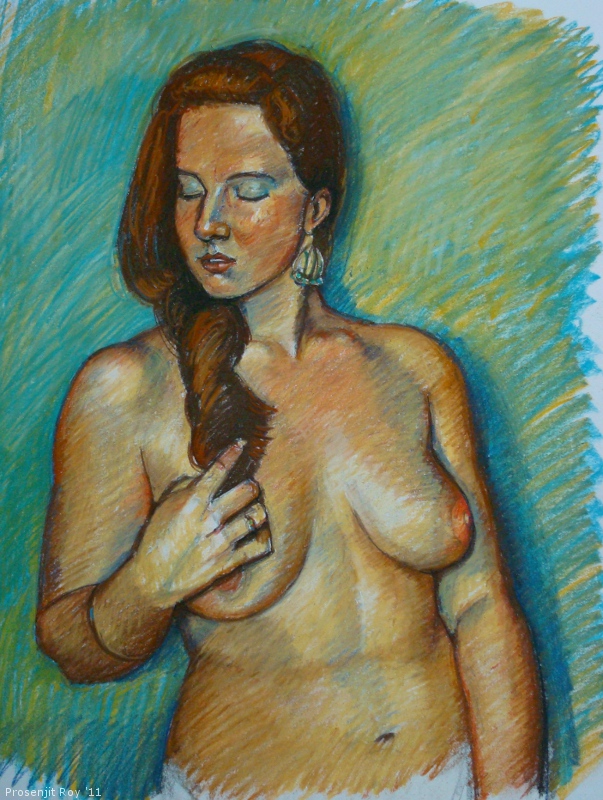
A3, pastel on paper. I love this way of obtaining
in-between shades by
optically mixing two or more colors - the retina
tends to interpret a mix of the different-colored strokes (which are
laid cross-wise or in parallel) as a tertiary color.
In case you're interested - posted below are a couple of
old (2011) w.i.p sequences, showing the same technique in some detail. These I had posted elsewhere, although I'm not sure if I had posted the last sequence in
this blog as well. Being more than 2 years old, the technical quality of the drawings, and my understanding of form is obviously inferior - but then, that itself is something to learn from :)
Sequence 1
15" x 11", pastels on cartridge paper.
1. The initial sketch in Conte sanguine pencil. Will fix drawing issues later as the painting progresses.
2. Having painted the background and hair, I started laying down the
under-layer for the face. The face had a light, blue-violet(ish) cast in
the reference, so this underlayer will 'peep' through the hatch marks on
the over-layers - thus achieving an overall optically mixed tone.
3. I darkened the eyes and started mixing a crimson-pink tone with the
blues, but in strategic areas to reflect the colors variations on the
face. Where I wanted the mix to be more subtle and the tone lighter (as
in the neck area) I used wider spacing between the hatch marks, which
were also placed parallel to each other. Whereas on the cheek and other
areas, the marks were crossed and denser.
4. Have started to add the over-layers - the scarlets and the pale
creams. Have also worked further on the lips. The whites of the eyes
still have a light greenish underlayer. I'm gradually encroaching upon
the highlit areas now
5. Finished version. I have used light finger blending to harmonized
certain areas, but the strokes mostly retain individual definition.
Could have worked more on a few small areas, but I thought I'd call it a
day and decided to put it away.
Sequence 2
15" x 11" on white cartridge paper using assorted brands.
1. The initial sketch in black conte. Looks a bit too finished, and
that's because at first I didn't intend to bring out my pastels for
this. I've already started to work on the background...
2.
Background :- applied white on the undermix of cerulean blue and light
orange, and lightly blended it all (with the thumb).
Figure :-
beginning to apply the under-layer... I intend to optically mix this
with subsequent layers.
3. Have started to integrate the different layers. Very light blending here and there, mostly cross-hatching strokes.
4. The finished painting. Approx 2.30-45 hours, done at one sitting.
Figure and portrait references by kind courtesy of (in order of top to bottom):
1. Cable9tuba in DeviantArt.
2. Tassjafocused in DeviantArt.
3. Daniel Burns (Tanis Macphail is model for the last two).
Thank You!