So this is a
horse (figure!) drawing demo :P that I made recently for another forum, at the owner's request. Copy-pasting...
Please view at your own risk, for I'm not an horse expert and frequently mix up the fetlock with the pastern. Heck, I didn't even know horses don't have clavicles! But I applied some human figure drawing techniques to lay down the basic shapes on paper, so here is a series of W.I.P shots. Hope some of it makes sense...
Here's what I ended up with... on A3 paper, with Sanguine Conte (and some watercolor for BG). Not satisfactory, ugh!
I referenced a picture of a plaster cast by an unknown sculptor, as found in the Guist Gallery.
I began drawing on this A3 sheet, roughly marking up the width of the subject in proportion to the height. In drawing, proportional measurements are more important than actual measurements, because then you can blow up or down your subject at your heart's desire. All I did was extend my arm straight towards the monitor, pinched off a length of my pencil between thumb and index, measured from the topmost to the bottom-most point of the horse (the hooves weren't visible, so I just roughed it up) and then turned the pencil at 90 degs to get the width, relative the height. The tail wasn't visible, so I measured only up to the end of the buttock.
The subject was a bit foreshortened in the ref, with the head a little closer to us than the back side, so I allowed for a little bit more of the width to compensate for that. If one were to draw objectively (i.e. just draw what you're seeing), which is what we ought to do for studies such as this, one needn't do such subjective corrections.
(Please disregard the faint black lines in the demos below, which are from a previous drawing)
I started with the head as a unit, measuring from its topmost to its bottom-most, and roughly estimated how many heads (or head-units) will fit vertically within the given area (previously marked off), and then horizontally. A rough estimation of the mid point of the horse at his time, using the horizontal and vertical extents in the previous pic, will also be helpful. What we are trying to do is establish some navigational points in all that empty space, so as to help us place body parts. This is less cumbersome than using a grid, while not losing the intuitive flow of the process.
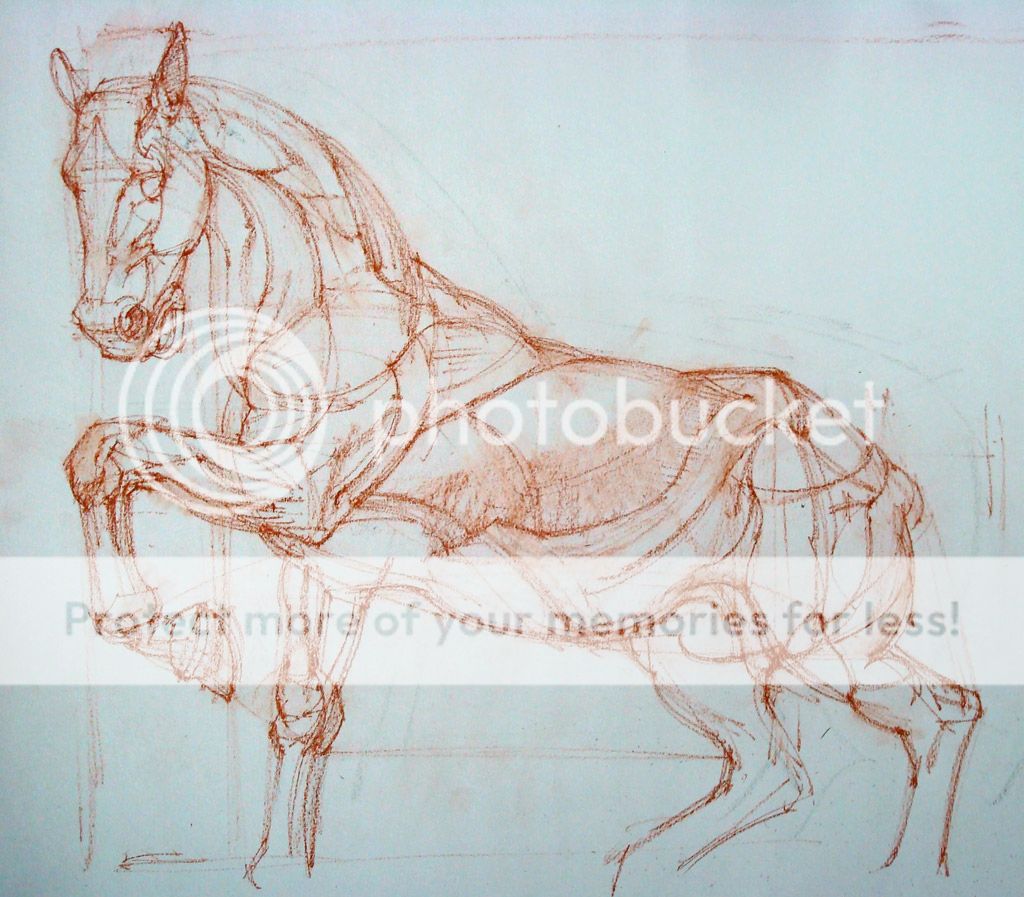
I've also dropped verticals to check which body parts fall in line with each other. Check the line that goes up from the bottom of the hoof to the angle of the neck. This can also be done horizontally, like the line that extends towards the right from the bottom of the head. While doing this, one must not lose sight of the larger picture and always keep in mind the over-all designated area for the drawing. Its important to note, that in this technique at least, the drawing is not growing from one point and spreading up, its going from the most basic shapes to greater details.
The head of the horse itself has been divided into parts, using the distance between the top of the head to the top of the eye, a bit like how we mark up the human face area into top, middle and lower thirds.
Using the same method of comparing horizontal and vertical alignments of various body parts, and keeping an eye open for their relationship with the midpoint and the outer-most extents (as established in Pic no. 1), the basic horse shapes are drawn. Please note how I've barely touched the head, which I'll deal with only after the horse shape is complete. Same with drawing a human figure, and anything for that matter... go from the general to the specific, less to more detail all the time.
Another thing to note here is the curves... like the one that cuts across the upper part of the near, front-leg, connecting upper chest area with the neck. There is another one, albeit faint, that curves across the belly, connecting the front of the far, rear-leg with the dorsum (where the rider sits). Continuing such curves through the substance of the body is another important tool to establish
way or navigational points, so that body parts stay coherently connected and is not seen to be floundering in space. The entire body is connected by a fantastic sense of rhythm, and our drawings need to reflect that.
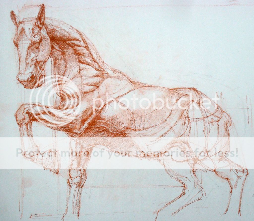
Now I'm going into further details, drawing individual parts, like the ear, eye, nostril, and also the basic muscle shapes. Again, one must keep in mind that these parts are all logically interlinked, they just don't happen to be there... nothing is out of place (if it is, its a cancer!).
Having drawn the shapes, I'll now draw the form or the 3-d aspect. Light is responsible for the appearance of objects in 3-d, as light decays into shadows to give objects a sense of turn. When an object eclipses a light source, it appears as a dark, 2-d shape called silhouette (Think of the spherical moon appearing as a disc on the sun during solar eclipse).
Here I'm laying down finer lines to block out the shadowed areas from the lit areas. These lines establish the area of 'turn' in the surface convexity, in relation to the incident light. The shadow areas will then be filled with a uniform mid-dark.
The lines I'm referring to are the 'terminator lines' (No. 6 in the fig below), which are nothing but areas of deepest shadow as light decays on the turning surface.Sharper the turn, thinner the terminator zone. On the edge of a box, its like a line.
 |
Slight correction in the figure above: 'No. 5 - Light reflected from the
shadow and the ground. The source for this being the ambient light and the ground reflection...' |
After this, my drawing is as good as yours (in fact yours will be much better, as I'm already beginning to lose patience - what with this conte pencil frequently breaking its tip... aaaargh!). I'm trying to be mindful of the larger muscle shapes and going into sub-shapes (or sub-bulges, e.g. individual fasciculations on a large muscle) only when the form of the largest shape (the light-dark breakup, and the tonal decay) has been taken care of. At least, ideally that's what I should've been doing.
So this is what I ended up with... just added a light watercolor BG. Thank you for being so patient with me! :)
(Update) Just another horsey sketch to end the post... this is from a drawing event at WC, in Nov, last year.