Showing posts with label portraits. Show all posts

Tuesday, July 16, 2013

Study of expression

Studying subtleties of expression in acrylic: 11" x 13.5", acrylic on paper.


Ref image by RoYakali in DA.

Monday, June 17, 2013

Upturned head study, plus more... (UPDATED)

**UPDATE - I've added two more sketches to this post. Please see below.

1. Upturned head reference in windy, low-light conditions... too hard to resist a study! 11" x 13.5", acrylic on paper.


Ref by Dinesh Francis.

2. A3, Charcoal.Warrior poses during drama rehearsal of theater group Perch, Chennai.


3. Approx A3, Soft pastel, digitally finished. From same event as above.


Refs by Muralidharan Alagar.

UPDATES...

4/5. A3, using a mix of conte, watersoluble pencils and watercolor. Sketches referencing a drawing event of PencilJam, Bangalore - visit to an ancient temple.


Refs by Dinesh Francis.

Sunday, April 14, 2013

color study

One less than satisfactory color study :/ The summer heat is getting to me, finally... and it can be difficult to concentrate at times. No excuses though. Tried out some new paint (Pebeo) I've recently purchased. So far I like what I see.

Acrylic, 11" x 13.5", on paper.


Ref image by BikeBoyPunk in DA.

Friday, March 8, 2013

Backlit... acrylic with W.I.P shots

One acrylic study, 11" x 13.5" on paper, with W.I.P. I'm anything but happy with this... my approach was too cursory, and the result unsatisfactory. Since I'd taken the w.i.p pics, I thought I might share it in any case :/


W. I. P... used the brush for drawing.


Ref image by Steve Evans (babasteve in flickr).

Thursday, February 28, 2013

Monochrome study, with W.I.P

11" x 13.5", acrylic on paper. Palette - Burnt  Umber (plus Titanium White). Ref - personal source.


W.I.P - I started with a brush drawing...


Wednesday, February 13, 2013

Study of Cardinal Turkson, with W.I.P

A3, watersoluble crayons and pencils. I found the ref image for Cardinal Peter Turkson of Ghana on the net (no info on who took it) and immediately liked the rich tones and his expression. I thought it'd be a good idea to study it with watersolubles, which I like because of its dual - drawing/painting nature. W.I.P. shots are also added.


As always, I'm grateful to whomever took the ref pic for this study, and would've loved to credit him/her.


Saturday, February 9, 2013

Head study in acrylic (Text added)

Edit: I've added some text at the bottom, in response to a query made by a friend from Chennai.

Apologies for the missing image - to those who've been wondering what happened to the post :) Made some minor modifications. Plus added a close up. Thanks for looking!

19" x 13", acrylic on canvas paper. Life study


Added text (copy-pasted from elsewhere):

"@ GS - as usual, you provoke a deeper look into the work, which gives me food for thought. All I can say is that, working from life provides you with a huge amount of info to choose from. While that may be overwhelming in the beginning, with (informed and alert) practice, one slowly tends to learn what to keep/emphasize, and what to ignore/downgrade. The tendency of portraiture students like me is to first look for a likeness, which should be the least of one's worries. Likeness ought be incidental, not as a result of conscious effort - ideally.

If I can get the head structure right, where the bony sockets/protuberances are in proper relationship to each other... that will be reflected on the soft tissue part. Once the shapes (both the outline and inner, overlapping ones) have been drawn satisfactorily, so that the eyes/nose/mouth are in proper horizontal/vertical/angular relationship, one moves on to work out the basic value separations i.e. identifying the lit from the unlit areas. Once this is done, one has to work out the half-tone areas, which are lit... but not 'high-lit', if that makes sense. The shadows/unlit areas, which were painted in a medium value darkness, are then further defined with darker darks. The lightest areas in the shadow must be darker than the darkest area in the lit portion.

Now, the progression of unlit to lit portion (i.e. the shadow junction area) may vary according to the curvature of the surface - its gradual where the turn is gradual, but quickly becomes lit with the brightest value where the turn is sharper. That has to be worked out as well.

The illusion of solidness you've referred to only comes after all this foundation work has been laid. You may then make those subtle value (and thereby, hue) changes, indicating minor, but very powerful topographical undulations. The latter works effectively only then, although it looks as if those subtleties are all that makes the difference between a good and an average work (mind you, I'm not all that happy with this one, so I lay no claim to it being 'good'... I'm just speaking in general terms :) )

As regards knowing where to put what ('choosing those spots') I think this is a skill which continues to develop as one becomes more and more aware of anatomy - 'the eyes do not see, what the mind doesn't know', its said! I can't emphasize on this fact strongly enough. An ever-expanding knowledge of artistic anatomy has a deep effect on one's figure work, which no amount of photo-realistic surface treatment (alone) can compensate for - its lack becomes apparent to the discerning viewer, despite a great deal of skill at rendering minute surface features. The work, if not sound structurally and functionally from within, will often end up looking like a superbly painted plastic doll, a shell without life.

Before I end this rant, here's a link to one of Bouguereau's nudes... the subtlest topographical changes are mind-boggling, and are often only partly apparent unless one tries to copy it in pencil or (preferably) paint. But under all this is Bouguereau's exacting standards for anatomy... this man didn't leave a single stone unturned in that regard. And yet, its all so very understated!"


Tuesday, January 22, 2013

The eyes have it... or not?

 Just a collection of eyes, cropped from various works painted over the last couple of years - these are in pastel, charcoal/chalk, acrylic, digital and watercolor.

Saturday, December 15, 2012

A few W.I.P's of past and present works

A few W.I.P's... apart from the top one, which is conte on tinted paper, the rest are in acrylic. If you're using a 800 pixel wide monitor you may see a spill-over into the right hand column... please click on an image to see its enlarged version (or right-click to open in new tab/window).


Monday, October 29, 2012

The Conte and the Caveman

Err... not him @ subject of portrait. He's a very fine gentleman from Chennai, India. I was referring to the artist. But read on please...

Approx. A4 in size, conte.


 After I had posted this drawing on an art forum, a member asked me how I could get those very thin lines with conte. He was actually referring to the 'conte sticks' (pic below) - those short, square cross-section sticks that Conte makes. I wrote back that I didn't, since I was (also) using conte pencils (pierre noire). However, even the humble conte stick is capable of doing wonderous things, including making those very fine lines! Having said that, I waxed eloquent on the following, which I'm (largely) copy-pasting below...

By the way, the ref image is by Muralidharan Alagar, modeled by his friend Sumit, taken on the occasion of an art camp at the Cholamandal Artists' Village, Chennai.

It was mid- to late-afternoon. I had just finished the portrait above, which was then posted online, immediately following which the query was made. I wanted to demonstrate the versatility of the 'used' conte stick and took its picture. Then I proceeded to draw the ear sketch (posted further below). When used with a soft enough hand, and after you have got it shaped in that way (following a period of use), the stick is wonderfully versatile in producing a wide variety of marks - both in line depth and line thickness/width. I'll elaborate further..

Look at the many micro facets on its surface, the very sharp and pointy tip, and the knife-like edge that's extending down from it. Remember paleolithic tools used by cavemen? Those sharp-tipped, multi-faceted stones they used as arrows and knives? Well, this conte has become like a softer version of those (with me being the caveman in my studio-cave :D).


 Now look at this little sketch (top half of an A4 page clipped to a board) which I made just after taking the pic above, entirely with that very conte - so as to demonstrate its wonderful versatility. These are a couple of ears, drawn side by side (from same ref actually, although shapes have differed). The one on the left shows just the outline, while the other one has tone, mostly achieved with hatching (I have used a moistened brush to even out the tones later on, but that's irrelevant to our discussion). Can you see the very fine hatching lines (which the arrows are pointng at) drawn with the sharp tip?


Thanks so much for viewing/reading.

Saturday, September 29, 2012

Sketches from Holland

Text has been updated on Sunday, 7th Oct. '12.  Sketches from a recent, short trip to The Netherlands; Displayed in no particular order, and including some  'non-human' figures as well... All are on 11" x 9" cartridge; Media used - conte and watersoluble crayons/pencils.

Please click to enlarge and view in proper magnification.

From one of Frans Hals' civic guard paintings ; Frans Hals museum, Haarlem

Same as above. This was the first of the Hals studies, and sketching as I was from a low sitting angle looking up at these giant works, it took me time to adjust to the perspective distortions. The Dutch being very discreet and polite, silently sat next to me, or stand behind me, watching me work. Only when I had finished working did they offer a word of appreciation. However, there were tourists from other places who were less so :P and some kept going to and fro the painting and me, commenting on which particular face I was drawing! I was of course, enjoying all of it... the ambiance, my work, the people, and the master works.

Same as above

From  Hendrik Goltzius' Hercules; Same venue as above. It was kind of a shock for me to suddenly 'discover' this huge painting... looming above and in front of me, as I walked into the room. I was already quite familiar with it, but had no idea Frans Hals museum had this painting. 

Also a Goltzius study (As I stood sketching, my sketchbook precariously balanced in the crook of my elbow, a nice gentleman... museum staff, asked -'would you like to have a chair?' We then dragged in a  huge red-topped bench from the adjoining room :) )

The Rembrandt sculpture at Rembrandtplein, Amsterdam. It was raining quite heavily, and I had to flee to the transparent shade of the adjoining tramstand and sketch from there. Hence the sideways view.

Unknown bust (to me, i.e... forgot to record the details) at Rijksmuseum, Amsterdam. In the end, I became a spectacle as well... the crowd was quite heavy and people also started to stand around me and watch, and some were shooting vids/pics of the process. Who wouldn't want to record an extra 'event' at such a museum :P

Same as above venue

Same as above venue, at the top of the wooden stairwell. The figure painted on the left, in the image below was on one of the walls around this sculpture.

The figure on the left was a study of a painting (again, I failed to record the origins, ugh!), sketched from another room, viewed diagonally through the door. In the end I gave up sketching as too many people were passing through. The one on the right (Rembrandt's 'Jewish bride', of course!) was sketched in similar crowded conditions - its fascinating to watch the popularity of such timeless masterpieces. Rijksmuseum was so kind in allowing me to sketch in there. One of the guards, who surprisingly spoke little english (for the Dutch are very proficient in english) greeted me with a wide grin and 'Ahh... Mr Artist!' when I visited the museum the next day. 

I had fun sketching this Rembrandt SP... I could only see momentary glimpses of it, sitting from the sofa in the middle of the room, as heads of people continued to eclipse it frequently. 

A touch of India in Holland. Still life of wooden elephant - heartiest thanks to the owners for allowing me to sketch :)

Fish stall at Zaandvoort aan zee, which is on the North Sea coast to the west of Holland. A windy but brilliantly lit day. A young Dutch historian had informed me that 'The Japanese are not the only ones who eat raw fish, we do it too!' :D And true to his words, raw herring, glistening in some kind of oil I guess, was being sold here. I'm not a fish person at all, but in order to experience some essence of the place, ordered a plate of fried fish and chips. I did ask beforehand if they would be too fishy, to which the stall-owner broke open one of those finger sized fries (in a crumbly brown jacket) and reassured me 'Oh no no, these are like half potato, and half fish'. Indeed, they were delicious.. notwithstanding the smell of fish in the air. Loved it!

He/she patiently modeled for me for close to 10 mins as I sat softly whistling and sketching. There was another kind of black, crow like bird (although with a much shorter beak), very restless and agile... hopping around. 

Bust of a young Dutch intellectual, sketched in failing daylight. Heartiest thanks to the owners of the bust :) and the sculptor.

Wednesday, August 8, 2012

Portraiture Construction Lines

This video shows the basic construction lines used in drawing a portrait, as per Andrew Loomis' guidelines. I posted this on wetcanvas, art website, in response to a query posted by member scoobydoo on how to get a likeness in portraiture. Software used to paint digitally - Mypaint, and to screencapture - Camstudio.

Direct link to Youtube (in case you can't see it full screen in here)


I'm thankful to the late, great Mr Loomis for his insight, to scoobydoo and her daughter (subject of the portrait, from pic kindly posted by scoobydoo), and to the orchestra (snippet played at the end of this video) - I have no idea who they are, and would love to learn and gratefully acknowledge if I could.

Friday, July 6, 2012

Minimal palette study 2 (save the teal, i.e.)

11" x 13.5", acrylic on paper. Palette - Burnt Umber, Burnt Sienna, Titanium White (plus some 'Teal' added as an afterthought) .Referenced from Wilhelm von Gloeden's photography.


Thursday, July 5, 2012

Minimal palette study

 11" x 13.5", acrylic on paper. Palette - Burnt Umber, Burnt Sienna, Titanium White. Ref. from the work of legendary photographer Wilhelm Von Gloeden.


Monday, June 18, 2012

PJ trip sketches

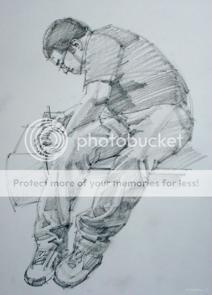
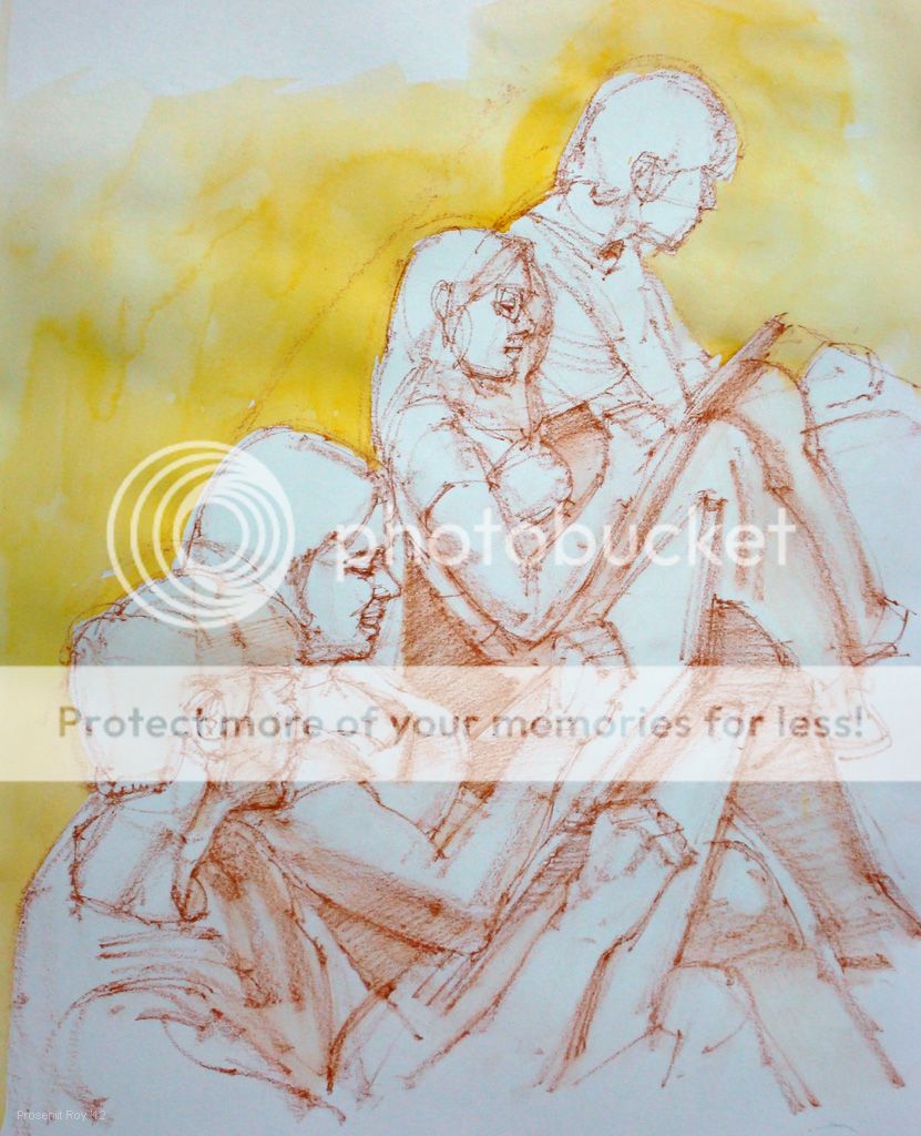
These are sketches referencing pics from a trip that an art club in Bengaluru (Banglore), Pencil Jammers recently undertook. Many thanks to Sridhar Comaravalli and Paranirajan for the study references.

All are on A3 size paper, using a combination of conte, watersoluble pencils/crayons, and watercolor (mostly for background wash). Please click to view at FULL size.