Showing posts with label tutorial. Show all posts

Wednesday, August 31, 2016

Decoding a complex pose

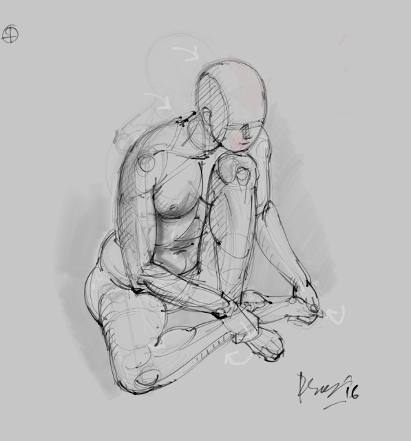
A fellow artist (cartoonist) had requested me tips on how to go about 'untangling' and study this digital sketch of mine, which was an adaptation of a little figure study by Vinayak Karmarkar (the late, great Indian sculptor whose works I've recently studied at Sasawane, Maharashtra). So I posted a reply along with a few digital sketches, to explain how I went about doing it. I hope this will also be of some use to my kind visitor(s).

The digital sketch... (done with Mypaint 1.0 software and Wacom pen/tablet)


And my reply...

Hi, many thanks!

Indeed, a deceptively complex pose - worthy of study with ball or digital pen :) Below is a pic I have taken of the plaster cast kindly gifted to me. I did the study from a slightly higher point of view, but I think you'll still get an idea of how very 'tangled up' the pose is! Further below I've posted a few digital sketches, trying to break up (and clarify) the pose a little. Hope it helps.


Here I've omitted the upper limbs to give a clearer (albeit highly schematic) picture of the vertebral column (how it bends), the pelvic structure, the bending of the legs and the overlapping of feet. The red arrow indicates how the neck should bend forward, so that the chin may rest upon the left knee.


Here I've fleshed out the figure a little with the white outlines. Morever, the curved arrows in white indicate the various actions taking place in the pose e.g. curling of the right hand under the right leg (near ankle); of the left hand under the left toes. Since the vertebral column is bending forwards, its spines (not visible) will tend to stick out in the back, while the abdominal flesh/muscles will be compressed - thereby developing deep flexure lines. There is also pushing out/bulging of flesh here and there due to compression at various flexure sites (I have to say, as a cartoonist, you're already aware of squash and stretching, although in a different context)


The last pic further clarifies what I've mentioned just above. The flesh sticking out in the gluteal region to her right is a combination of muscle and fat, being compressed between the floor and her upper thigh, and between her pelvis and thigh. The extent of this bulging will vary between subjects and between genders. Similar bulging due to compression is seen in the abdominal area, and where the knees are flexing.


In my final study (on which you have commented, and which is posted at the top), the effect due to clothing is superimposed upon the naked figure. Of course, one needs to learn to visualize the underlying structure - bones, muscles, flesh and skin, in order to design the drapery more efficiently. I think, some amount of direct observation along with studied knowledge can help us decode any pose, however tangled/foreshortened. Thanks again for asking :)

Monday, October 20, 2014

The making of Lady with Flute (w.i.p)

The Making of Lady with Flute (W.I.P). Other details and enlarged versions of this can be viewed in this post. I can't post a larger image because of size restrictions in blogger :-/

Full sheet (22" x 28") cartridge, dry pastel + some watersoluble pastel for background.


Tuesday, September 17, 2013

A few basics on drawing and painting

This article is an expansion/modification of an email I wrote to a friend, in response to a request  for a critique on a still life (a fruit arrangement not included here). I later added these W.I.P pics of a small pastel, which I've used for the demo. The pics help illustrate the ideas contained in the article. I hope its of some use to whomever is reading this post, even though at times it may read as being addressed to a particular person.


We are often recommended to paint still lives, even though we may not be particularly attracted to that genre. I love painting figures, so I'm not exactly a 'still-life'-ist or a landscape-ist. But I do realize the importance of painting still lives. Here, the idea is not to make picture-perfect, finished paintings (although you may do that if you wish to), but to teach us about -

  • shapes (the outline of objects),
  • how these shapes overlap (objects in front of one another),
  • their perspective
  • the effect of light on these objects (which gives them volume),
  • how to interpret and then make different mixes of colors. 
All these are tremendously important in improving our ability to look, which is the primary skill one needs to develop in order to improve drawing, painting, coloring and value skills - all of which undoubtedly affect the quality of our regular work (be it 'abstract' or 'realistic').

Now, a couple more points I would like to make about the still life (this particular one which I have critiqued  was a basket of fruits):

1) Simple light arrangement - You've chosen a rather complex, multi-directional lighting for this (I can see at least two shadows on the ground). Its best to have just one shadow casting light, angling in from top-right or top-left, slightly to the front (daylight from a single window will do, if not use a common light bulb - not the diffuse tube light!). A white or very pale colored wall on the side opposite to the light source, or a white sheet /curtain strategically hung, will reflect a soft glow on the shadow side of your target object(s), thus bringing out the darker shadow zones between the direct light and the reflected glow. This will enhance the sense of dimension even more.

A common incandescent light bulb, which is a 'point source' like direct sunlight, will cast sharp shadows of an object on its neighbor(s). At the same time, the shape of that neighboring object will also affect the shape of the cast shadow itself. Imagine/compare the shadow of a post on the flat ground, with that on a corrugated surface. In the first instance the shadow will be straight, while it'll be wavy in the latter. Noting this phenomenon will further co-relate one object in the present still-life assemblage to another, and also to the ground on which it is placed. Obviously the ground will also receive a cast shadow, and if its covered in a piece of cloth that has folds/ripples in it, those will also affect the shape of the shadow.

N.B. We may later on (while painting) note the color of the shadow - its usually a darker version of the local color of the object, on which it has formed. However, if there is a softer, secondary light filling the shadows (e.g. the light from the blue sky on a sunny day, when the sun is the primary light), the shadows will be bluish. This is especially seen on a white/pale object, which by itself minimally affects the color of the secondary illumination (think of the shadow side of a snowman under that blue sky). Here the sun can't illuminate places where shadows are formed, while the diffuse sky light, coming from all around, tints those shadows with blue.

Bottom line - have a simple still-life arrangement, with one point-source light, angling down slightly from the front. Plus a pale reflecting surface on the opposite side.

Have a look at this still life by J B Chardin (click to enlarge and study closely if you want to)... see how well integrated each object is to one another with those reflections, counter-reflections and shadows!

http://en.wikipedia.org/wiki/File:Jean-Baptiste_Sim%C3%A9on_Chardin_029.jpg

Another painter whose still lifes I like a lot - Fantin Latour : http://www.artcyclopedia.org/art/henri-fantin-latour-flowers.jpg

2) Value study - I think your still lives would further benefit from preliminary value studies. I'll explain;

After you've drawn the shapes, do the following -
  • Notice where the light is coming from, and the direction in  which it's casting shadows. There are also shadows on the objects themselves (lets call these body shadows), apart from the cast ones. Indicate lightly, say with a pencil, the areas which are in shadow and which are in light. Some areas will have a diffuse transition zone between lit and un-lit areas, depending on the shape of the object (diffuse for round/cylindrical objects, sharp for boxes, which have corners). Indicate accordingly with hatching marks. 
Remember, this is only a kind of training, helping you to look for areas of different illumination in the scene. So don't go overboard with your  hatching, unless you're doing a finished pencil drawing. Also, disregard all reflected illumination at this point, even if you can see those.

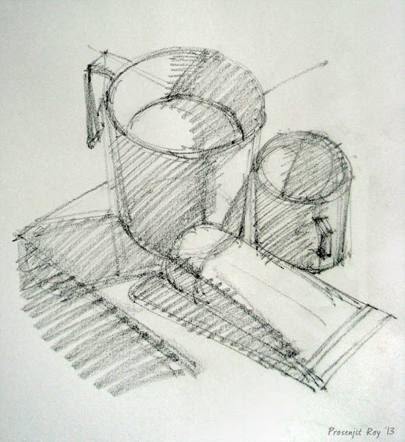
 This is a small sketch, approx 6" x 6", of a simple still life arrangement. At this stage, I've indicated the basic shapes, and how these are overlapping each other.


Here I've separated lit from unlit zones, and filled up or 'blocked' those shadow areas. Notice the shadow of the cup, cast on the lower corner of the mug.  So, once you've separated the shadows from the light, fill up those shadow areas with a homogenous, middle-gray (use plain, diagonal hatching marks to do this quickly, kind of like what I've done, if you ultimately intend to 'paint', rather than 'draw' this scene).


Since I had also intended to do a little drawing demo, I went ahead and did a rough finish as you can see. Normally, I wouldn't have bothered to do all that shading, and directly gone on to the painting stage.


Here I've indicated, with colored arrows, the different shadow zones -

Red arrows  - reflected illumination or 'glow'; This is within the blocked-in shadow zone, being softly lit by light reflected from surrounding areas e.g. a nearby wall, curtain, floor. This area must never be brighter than the directly lit areas.


Yellow arrows point to the darker shadow zone between the lit and the reflected glow areas. This is also known as the Core Shadow area and are very important in giving that 'sense of turn' to the object. Beyond the core shadow area, the object gradually emerges into the lit zone, revealing its true local color.

Blue arrows - cast shadow areas. Note that this is darkest closest to the object (e.g. the rim of the mug near the table-top, or immediately under the paint tube). Cast shadow areas are often lit up in the color of the secondary light, as explained in sections above. When using a single point-source light, cast shadows have sharp edges.

Green arrow - indicates the highlight zone, which has the maximum concentration of light rays directly reaching the viewer's eyes (hence often appears burnt out, or 'white'). Depending on the shape of the object, the shape of the highlight may change (e.g. its linear on the side of a cylindrical/conical object, round on a spherical one). It will also vary according to the texture of the object's surface. Shiny objects will have small, bright highlights. Rough objects will have dimmer, wider highlights.

The middle tone - This is the lit area between the high light area, and the core shadow area (i.e., area between maximum light and maximum dark on the object concerned).  It is to be painted with the actual color of the object.


The painting stage and the value study -

(I was using dry pastel for this demo, and taking pictures at successive stages. I continued to do that until I finished painting, but later on did a quick-ish digital painting on the pencil/charcoal stage of the picture, to better illustrate the value study. So the following two pics are digitally painted over the pencil base)

 If you're painting with potentially opaque colors like acrylic or oil, you may take some Burnt Umber, dilute a little with water/solvent, and fill up or block-in all those shadow areas. Remember, this is just a middle-dark tone, not your darkest dark! So try not to paint opaquely. The value study is aimed at understanding the different values (i.e. degree of brightness or darkness) at different areas of the scene


After this, extend that burnt umber tone (previously painted in the shadow zone) towards the lit area, progressively lightening it with water (or white paint, whatever is convenient), from the shadow zone upto the highlight zone. As mentioned previously, this is the middle tone of your picture - these areas are not in shadow, but between the high light  and the shadow areas, and they are most representative of the object's colors.


After you've painted the middle tones, and thereby established the highlights as well, stand back, and look - ascertain which areas need the darkest darks (i.e., those areas where no light is reaching, e.g. near the rim of the mug close to the table-top). Without diluting your umber, paint those areas directly. You may add a little prussian blue to the mix to darken further. Now you have a complete value study of your scene.

I'd suggest, paint a few of these value studies using simple still life objects - say a cup on a saucer, placed on a white cloth. The value study may also serve as an Underpainting, over which you may continue to add progressively opaque layers of color, with the  underpainting  guiding you on the local value.

So I continued to paint with dry pastel from pic 3 onwards...

I've used a burnt umber shade to do the initial block-in. Then I've painted the middle tone areas with a few broad strokes, just to indicate to myself the actual color of the objects. Note the sample color patches at the bottom left, representing the colors of the mug, cup, tube and table-top. I'll later choose some other color for the background. This whole thing served as my pastel underpainting.

.
I continued to add color on top of this 'underpainting' - remember, a color in shadow is not black, its just a darker version of that same color. The opposite is true for that color in the highlight zone, i.e. it is a lighter version of that same color. If you're painting objects with surface patterns, textures etc, (e.g. apples, which has linear streaks)... paint the dominant color first. Say, a shade of red. Paint it out entirely in that color, modifying its values according to the shadow scheme. You may paint the texture streaks later on, while finishing up.


Here I'll repeat what I've already said during the value study (digital) demo -  After you've painted the middle tones, and thereby established the highlights as well, stand back, and look - ascertain which areas need the darkest darks (i.e., those areas where very little light is reaching, e.g. near the bottom of the paint tube). Without diluting your umber, paint those areas directly. You may add a little prussian blue to the mix to darken further.


Now is the time to paint reflected glows on the shadow side. Always remember - these indirectly lit areas MUST NEVER be brighter than areas which are directly lit. Most often, they take on the color of the neighboring object light is being reflected from - so, if  there's a green fruit near a red apple, the reflected glow will have a green tinge on that apple's shadow area. Also, a matt surface will reflect less light (and thereby color) than a shiny surface, so all objects may not be similarly lit/colored by reflected glow.

The finished study, 6" x 6", pastel on paper. Took me about 1-1.15 hrs (excluding the digitals, of course).


 Arrows pointing to reflected light/color on objects on their shadow side. The paint tube is reflecting color from the blue table-top, the yellow cup is reflecting color from the reddish tube itself.


Lastly (but hardly the least!), take care of the edges... which are nothing but areas on an object that is turning out of the viewer's eyesight. The object is not ending, cut-out like, in that area. So, there must be that sense of turn to the edge. Usually, edges take on color from neighboring areas. Say, a bald man's head, who is standing under a blue sky, will have a bluish tinge near the edge. The best advice is probably to observe carefully, and then paint what we see. The more we paint draw, the more nature will reveal its wonders to us! Thanks for reading :)

Sunday, March 24, 2013

Horses are figures too - 4 (with W.I.P)

N.B. Picture updated with a larger and sharper one.

I use the same technique to draw horses, that I use to draw homo sapiens. Namely, the head height as unit for measurement. Served me well in this acrylic study as well -

28" x 22", acrylic on paper.


And here is the W.I.P sequence:
  1. The drawing in charcoal - just a basic shape outline with some suggested value changes
  2. The drawing lines 'inked' over with burnt umber (mainly) and prussian blue.
  3. Added the background (imaginary).
  4. Painted a transparent layer (leaving a few areas paper-white), to understand the tonal variations.
  5. Opaque layer partly added
  6. The finished painting as above. 


Ref image by Breathless-dk in DA.


Monday, February 25, 2013

Figure Workshop in mid-March

Penciljammers has kindly entrusted yours truly with conducting yet another Figure Drawing / Painting workshop (Demystifying the Human Figure) in mid-March. Three days is really insufficient to cram in the lot of info I aim to include in the course, but I hope it'll give pupils some pointers in the direction I've personally found useful. I'll begin with the basics of line and end with painting from the live model. There will also be a short lecture/demo on the basics of artistic anatomy and guidelines on portraiture (drawing and painting). For painting, I'll be using acrylics as medium of choice and also (with time permitting) touch upon color-mixing for skin color.

Hopefully it'll be an enjoyable affair for all concerned. I love visiting Bengaluru (Bangalore).


Wednesday, February 13, 2013

Study of Cardinal Turkson, with W.I.P

A3, watersoluble crayons and pencils. I found the ref image for Cardinal Peter Turkson of Ghana on the net (no info on who took it) and immediately liked the rich tones and his expression. I thought it'd be a good idea to study it with watersolubles, which I like because of its dual - drawing/painting nature. W.I.P. shots are also added.


As always, I'm grateful to whomever took the ref pic for this study, and would've loved to credit him/her.


Saturday, February 9, 2013

Head study in acrylic (Text added)

Edit: I've added some text at the bottom, in response to a query made by a friend from Chennai.

Apologies for the missing image - to those who've been wondering what happened to the post :) Made some minor modifications. Plus added a close up. Thanks for looking!

19" x 13", acrylic on canvas paper. Life study


Added text (copy-pasted from elsewhere):

"@ GS - as usual, you provoke a deeper look into the work, which gives me food for thought. All I can say is that, working from life provides you with a huge amount of info to choose from. While that may be overwhelming in the beginning, with (informed and alert) practice, one slowly tends to learn what to keep/emphasize, and what to ignore/downgrade. The tendency of portraiture students like me is to first look for a likeness, which should be the least of one's worries. Likeness ought be incidental, not as a result of conscious effort - ideally.

If I can get the head structure right, where the bony sockets/protuberances are in proper relationship to each other... that will be reflected on the soft tissue part. Once the shapes (both the outline and inner, overlapping ones) have been drawn satisfactorily, so that the eyes/nose/mouth are in proper horizontal/vertical/angular relationship, one moves on to work out the basic value separations i.e. identifying the lit from the unlit areas. Once this is done, one has to work out the half-tone areas, which are lit... but not 'high-lit', if that makes sense. The shadows/unlit areas, which were painted in a medium value darkness, are then further defined with darker darks. The lightest areas in the shadow must be darker than the darkest area in the lit portion.

Now, the progression of unlit to lit portion (i.e. the shadow junction area) may vary according to the curvature of the surface - its gradual where the turn is gradual, but quickly becomes lit with the brightest value where the turn is sharper. That has to be worked out as well.

The illusion of solidness you've referred to only comes after all this foundation work has been laid. You may then make those subtle value (and thereby, hue) changes, indicating minor, but very powerful topographical undulations. The latter works effectively only then, although it looks as if those subtleties are all that makes the difference between a good and an average work (mind you, I'm not all that happy with this one, so I lay no claim to it being 'good'... I'm just speaking in general terms :) )

As regards knowing where to put what ('choosing those spots') I think this is a skill which continues to develop as one becomes more and more aware of anatomy - 'the eyes do not see, what the mind doesn't know', its said! I can't emphasize on this fact strongly enough. An ever-expanding knowledge of artistic anatomy has a deep effect on one's figure work, which no amount of photo-realistic surface treatment (alone) can compensate for - its lack becomes apparent to the discerning viewer, despite a great deal of skill at rendering minute surface features. The work, if not sound structurally and functionally from within, will often end up looking like a superbly painted plastic doll, a shell without life.

Before I end this rant, here's a link to one of Bouguereau's nudes... the subtlest topographical changes are mind-boggling, and are often only partly apparent unless one tries to copy it in pencil or (preferably) paint. But under all this is Bouguereau's exacting standards for anatomy... this man didn't leave a single stone unturned in that regard. And yet, its all so very understated!"


Monday, October 29, 2012

The Conte and the Caveman

Err... not him @ subject of portrait. He's a very fine gentleman from Chennai, India. I was referring to the artist. But read on please...

Approx. A4 in size, conte.


 After I had posted this drawing on an art forum, a member asked me how I could get those very thin lines with conte. He was actually referring to the 'conte sticks' (pic below) - those short, square cross-section sticks that Conte makes. I wrote back that I didn't, since I was (also) using conte pencils (pierre noire). However, even the humble conte stick is capable of doing wonderous things, including making those very fine lines! Having said that, I waxed eloquent on the following, which I'm (largely) copy-pasting below...

By the way, the ref image is by Muralidharan Alagar, modeled by his friend Sumit, taken on the occasion of an art camp at the Cholamandal Artists' Village, Chennai.

It was mid- to late-afternoon. I had just finished the portrait above, which was then posted online, immediately following which the query was made. I wanted to demonstrate the versatility of the 'used' conte stick and took its picture. Then I proceeded to draw the ear sketch (posted further below). When used with a soft enough hand, and after you have got it shaped in that way (following a period of use), the stick is wonderfully versatile in producing a wide variety of marks - both in line depth and line thickness/width. I'll elaborate further..

Look at the many micro facets on its surface, the very sharp and pointy tip, and the knife-like edge that's extending down from it. Remember paleolithic tools used by cavemen? Those sharp-tipped, multi-faceted stones they used as arrows and knives? Well, this conte has become like a softer version of those (with me being the caveman in my studio-cave :D).


 Now look at this little sketch (top half of an A4 page clipped to a board) which I made just after taking the pic above, entirely with that very conte - so as to demonstrate its wonderful versatility. These are a couple of ears, drawn side by side (from same ref actually, although shapes have differed). The one on the left shows just the outline, while the other one has tone, mostly achieved with hatching (I have used a moistened brush to even out the tones later on, but that's irrelevant to our discussion). Can you see the very fine hatching lines (which the arrows are pointng at) drawn with the sharp tip?


Thanks so much for viewing/reading.

Friday, October 19, 2012

W.I.P. study on Rodin's Mahler


OK, this is pursuant to a discussion I've recently had on an art forum regarding modeling sculptures from unsatisfactorily lit references. It's always best to draw from the object directly (i.e, 'live'),  but often times all we have is a pictorial reference. However, if even that is not suitably lit (which means that the dominant light is preferably angling down from the side, in front, along with a soft reflected glow on the shadow side) and the shadows are scattered all over, the outcome is often flat.

In that case, one really needs to 'invent' a dominant light, and suppress the other sources. In this exercise, I've downplayed the other two lights in the ref - one coming from the front, and the one coming over his left shoulder. The main band of terminator or core shadow thus passes down the face, with his right side most well-lit. Mind you, this was really intended to be an 'example sketch' of sorts, to emphasize on certain points. In that respect, it is hardly a proper, patient study... took me about 2-2.30 hrs more or less.

W.I.P. no.1. - Outline.


Preliminary sketch in conte. After establishing the basic shape of the head, and putting in the facial features in proper relationship to each other, I was marking out the broad shadow areas. These I'll be filling in, in the subsequent w.i.p.


W.I.P. no 2. - Blocking in


After filling in or 'blocking' the basic shadow shapes, giving predominance to the light coming in over his right shoulder, I had used a moistened brush to 'push' the dark pigment from the shadows into the white areas. I preserved paper-white in the highlights only. You can see this effect on his right, forehead area...  those faint brush marks.

W.I.P. no. 3. Background


Here I've used some yellow ocher watersoluble pencil for the background. So as to better integrate the BG with the head, I have also introduced some of this BG color (as reflected light) on the bust itself. In the next/final stage (which is same as the pic posted at the top of this thread) I'll be adding more details.

FINAL stage


Here I've basically darkened certain areas in preference over others e.g. the eyes, the mouth etc., smoothened out the transitions between the variously illuminated areas a bit, and over-all... worked on the 'turning shadows' or terminator shadows (darker area between two illuminated zones) to give the form greater dimensionality. Actually this was the easiest part - work-wise, but I had to be careful so as not to 'equally blacken up' all areas. Since the illumination in the ref was scattered/indefinite... I had to ensure that the bust doesn't end up appearing flat, hence some careful contrast work.

Hope it all made some sense, and thank you so much for reading! :)

Wednesday, August 8, 2012

Portraiture Construction Lines

This video shows the basic construction lines used in drawing a portrait, as per Andrew Loomis' guidelines. I posted this on wetcanvas, art website, in response to a query posted by member scoobydoo on how to get a likeness in portraiture. Software used to paint digitally - Mypaint, and to screencapture - Camstudio.

Direct link to Youtube (in case you can't see it full screen in here)


I'm thankful to the late, great Mr Loomis for his insight, to scoobydoo and her daughter (subject of the portrait, from pic kindly posted by scoobydoo), and to the orchestra (snippet played at the end of this video) - I have no idea who they are, and would love to learn and gratefully acknowledge if I could.

Tuesday, June 26, 2012

Seeing Human, Drawing Rhino

Well, that's what I was doing when I sketched this rhinoceros from a ref. I was trying out human figure drawing techniques on an alternative form. Then someone asked me, what do you mean by that?... which unleashed this babblestorm of a comparison :P Hope you find it helpful...

 A3, conte, watercolor for background. Many thanks to the ref photog, who is unknown. Please view at FULL size. 

  • Human - I start by marking off the top and bottom extents (for a standing figure) on the page
    • Rhino - I marked off its lateral extents on the page.
  • Human - I roughly mark the mid-point, which is usually at the pubis
    • Rhino - here, I used the hump as mid-point, with the two 'halves' going off in two directions - 1) along the back, horizontally, and 2) obliquely down the neck towards the horn. I found these two 'limbs' of the (downward facing) angle at the hump to be approx. equidistant. Thus I have a basic measure of the shape.
  • Human - I use the vertical head height as a unit of measurement
    • Rhino - I found that, from the tip of mouth up to the neck-head junction, the antero-posterior length of the head roughly equals 2.5 times the total length upto the hump. I'm doing all this quickly, partly by eye estimation, partly by extending my hand (holding the pencil upright for measuring) at the ref.
  • Human - Using the head height as rough guide for proportions, I mark the different levels at which other parts lie e.g. shoulder width, nipples, navel, hip width, pubis/genitalia, knee, ankle, elbow, wrist etc.
    • Rhino - I did the same with the rhino, marking off widths and lengths of different body parts e.g legs, antero-posterior length of belly, thickness of neck etc.
  • Human - I try to find continuity of the curved outlines through the substance of the body, e.g. I do not look at the curvature of the hip outline in isolation, but how that 'inward' curve, if extended 'into' the body will progress, and 'emerge' on the opposite side... this helps me to further locate body parts in correct spatial relationship
    • Rhino - I did the same here, extending e.g. the front and back outlines of the legs, following their natural curvature, into the 'body' of the rhino... looking to see where they emerge. I did that with as many curved outlines (e.g. the belly, the rump area, the bottom surface of head etc.) as was convenient to build a harmonious outline shape of the entire 'figure'.
  • Human - at this point, I'm also extra aware of the stance/pose, balance/weight distribution.. is the figure tending to fall off or is it solidly grounded, is there a sense of weight to it?
    • Rhino - I did the same here, esp relevant for a large and massively heavy creature such as this. Its mass and weight distribution, to my mind, seem to dominate most other considerations of drawing!
  • Human - Now that the shape is in place, I add volume to it by noticing the direction of light, and adding the turning points or 'terminator zones' where  a surface is curving away from the dominant light source.
    • Rhino - the light was coming from top right, and its a bright sunlight so the shadows were crisp... I could conveniently mark off the form shadows (shadow on the form itself as it turns away from light) and the cast shadows (shadows of the form cast on an adjacent surface or form).
  • Human - Now I look to build the 'middle-tone'.. that is the changing values in the light areas as it moves from the edge of the shadows towards the point of greatest illumination(the highlight). If its a well-oiled body-builder with bulging muscles, this becomes fairly easy... you know how and where to 'taper off' your tonality as you approach the highlight area. Under a diffuse lighting, and with less well defined musculature you have to observe carefully to interpret the subtle changes of tonality, and thereby bring out the underlying form. Overall, light will tend to decay down the standing body (for a top light), with the legs being less illuminated than the chest area.
    • Rhino - he wasn't an well-oiled muscleman, but Boy... did he have sturdy forms! So it was fun to interpret these undulations, or sub-forms, while keeping an eye towards the over-all form of the animal relative to the illumination. As you can see light was decaying from the rump area towards the horn area.
Well... its easy to break it all down to theory, but while drawing (which took about 40 mins) I was doing these instinctively, and one step was really merging into the other, so that I didn't really have a conscious recollection of  doing it in steps. But having developed and followed a method over a period of time, you tend to use that in whatever you're drawing - be it a human, a horse, a rhino, or whatever. The only thing that's different between drawing a pile of rocks and a human is that, while the light/shadow principles are the same - you have considerable freedom as regards interpreting the overall shape/form, with the latter (i.e. human, rhino etc.) you have to be mindful of specific shapes, proportions and forms. But the techniques... of 'seeing', are basically the same.

Saturday, June 2, 2012

Digital Portrait Demo Jun '12

Another digital portrait demo in Mypaint... actual painting time about 35-40 minutes, video accelerated to about 9. Link to Youtube (please see in FULL screen)


Wednesday, May 23, 2012

Digital Portrait Demo May '12

Digital Portrait Demo Video (14.29 mins), showing approx 26 mins of drawing. Software used: Mypaint 1.0.0.

Link to youtube  (Please view in FULL screen)

The finished version after another 10-15 mins of tinkering about.


Wednesday, May 2, 2012

Video - Drawing a tangled-up pose

15 min (narrated) video of drawing a tangled-up pose, using Mypaint (drawing/painting software). The demo is slightly faster than real time (which was approx. 20 mins), in order to minimize file size. Ref by J L Anil Kumar, subject is Sandhya.

Direct Youtube link: http://www.youtube.com/watch?v=CVJFdV-jAJg (watch at larger size)


Wednesday, February 29, 2012

Horses have figures too!

So this is a horse (figure!) drawing demo  :P that I made recently for another forum, at the owner's request. Copy-pasting...


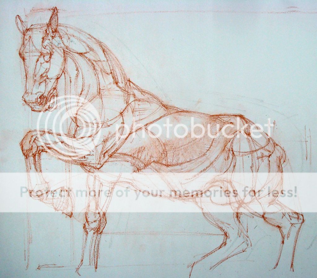
Please view at your own risk, for I'm not an horse expert and frequently mix up the fetlock with the pastern. Heck, I didn't even know horses don't have clavicles! But I applied some human figure drawing techniques to lay down the basic shapes on paper, so here is a series of W.I.P shots. Hope some of it makes sense...

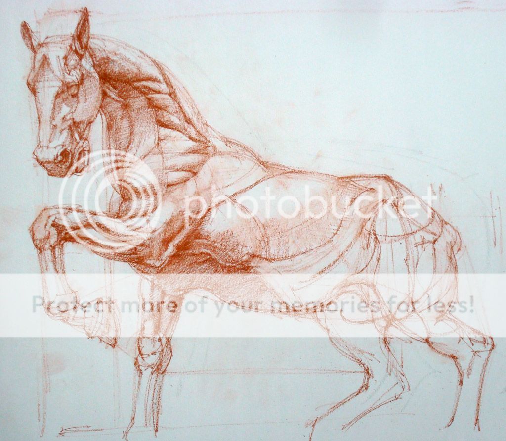
Here's what I ended up with... on A3 paper, with Sanguine Conte (and some watercolor for BG). Not satisfactory, ugh!

I referenced a picture of a plaster cast by an unknown sculptor, as found in the Guist Gallery.


I began drawing on this A3 sheet, roughly marking up the width of the subject in proportion to the height. In drawing, proportional measurements are more important than actual measurements, because then you can blow up or down your subject at your heart's desire. All I did was extend my arm straight towards the monitor, pinched off a length of my pencil between thumb and index, measured from the topmost to the bottom-most point of the horse (the hooves weren't visible, so I just roughed it up) and then turned the pencil at 90 degs to get the width, relative the height. The tail wasn't visible, so I measured only up to the end of the buttock.

The subject was a bit foreshortened in the ref, with the head a little closer to us than the back side, so I allowed for a little bit more of the width to compensate for that. If one were to draw objectively (i.e. just draw what you're seeing), which is what we ought to do for studies such as this, one needn't do such subjective corrections.

(Please disregard the faint black lines in the demos below, which are from a previous drawing)


I started with the head as a unit, measuring from its topmost to its bottom-most, and roughly estimated how many heads (or head-units) will fit vertically within the given area (previously marked off), and then horizontally. A rough estimation of the mid point of the horse at his time, using the horizontal and vertical extents in the previous pic, will also be helpful. What we are trying to do is establish some navigational points in all that empty space, so as to help us place body parts. This is less cumbersome than using a grid, while not losing the intuitive flow of the process.

I've also dropped verticals to check which body parts fall in line with each other. Check the line that goes up from the bottom of the hoof to the angle of the neck. This can also be done horizontally, like the line that extends towards the right from the bottom of the head. While doing this, one must not lose sight of the larger picture and always keep in mind the over-all designated area for the drawing. Its important to note, that in this technique at least, the drawing is not growing from one point and spreading up, its going from the most basic shapes to greater details.

The head of the horse itself has been divided into parts, using the distance between the top of the head to the top of the eye, a bit like how we mark up the human face area into top, middle and lower thirds.


Using the same method of comparing horizontal and vertical alignments of various body parts, and keeping an eye open for their relationship with the midpoint and the outer-most extents (as established in Pic no. 1), the  basic horse shapes are drawn. Please note how I've barely touched the head, which I'll deal with only after the horse shape is complete. Same with drawing a human figure, and anything for that matter... go from the general to the specific, less to more detail all the time.

Another thing to note here is the curves... like the one that cuts across the upper part of the near, front-leg, connecting upper chest area with the neck. There is another one, albeit faint, that curves across the belly, connecting the front of the far, rear-leg with the dorsum (where the rider sits). Continuing such curves through the substance of the body is another important tool to establish way or navigational points, so that body parts stay coherently connected and is not seen to be floundering in space. The entire body is connected by a fantastic sense of rhythm, and our drawings need to reflect that.


Now I'm going into further details, drawing individual parts, like the ear, eye, nostril, and also the basic muscle shapes. Again, one must keep in mind that these parts are all logically interlinked, they just don't happen to be there... nothing is out of place (if it is, its a cancer!).


Having drawn the shapes, I'll now draw the form or the 3-d aspect. Light is responsible for the appearance of objects in 3-d, as light decays into shadows to give objects a sense of turn. When an object eclipses a light source, it appears as a dark, 2-d shape called silhouette (Think of the spherical moon appearing as a disc on the sun during solar eclipse).

Here I'm laying down finer lines to block out the shadowed areas from the lit areas. These lines establish the area of 'turn' in the surface convexity, in relation to the incident light. The shadow areas will then be filled with a uniform mid-dark.

The lines I'm referring to are the 'terminator lines'  (No. 6 in the fig below), which are nothing but areas of deepest shadow as light decays on the turning surface.Sharper the turn, thinner the terminator zone. On the edge of a box, its like a line.

Slight correction in the figure above: 'No. 5 - Light reflected from the
shadow and the ground. The source for this being the ambient light and the ground reflection...'


After this, my drawing is as good as yours (in fact yours will be much better, as I'm already beginning to lose patience - what with this conte pencil frequently breaking its tip... aaaargh!). I'm trying to be mindful of the larger muscle shapes and going into sub-shapes (or sub-bulges, e.g. individual fasciculations on a large muscle) only when the form of the largest shape (the light-dark breakup, and the tonal decay) has been taken care of. At least, ideally that's what I should've been doing.


So this is what I ended up with... just added a light watercolor BG. Thank you for being so patient with me! :)


(Update) Just another horsey sketch to end the post... this is from a drawing event at WC, in Nov, last year.


Thursday, October 27, 2011

14 steps to Figure Drawing (UPDATED with pics!)

It looks formidable, all those numbers on that list! But with practice, one item tends to flow easily into the next, until it all becomes instinctive. I find this approach helpful, and had jotted it down in response to a friend's query on figure drawing. Thought I'd share it here as well...

N.B. This was drawn from imagination. I do not claim anatomical perfection, although anatomy can always be improved upon, especially with the help of references. Nor is this a finished drawing, being merely a bare-bones, structural representation of the figure. I did not work upon surface details, things which breathe life and personality into the drawing... but that's a different issue altogether.

Just remember whenever you're stuck always go for the largest shapes...


1. Draw the head - no details... just a helmet shape, with its visor (which is flat vertically, and curved from side to side) symbolizing the face area, and the rounded top as the top half of the head.

2. Draw the neck (1/3rd of face, which is measured from an assumed hairline to the bottom of chin)

3. Draw the ends or points of the shoulder (widest point)

4. Draw the gesture of the spine (or the mid-line in this case)... how it curves, tilts, twists - upto the pubic bone (crotch). This is approx at or a little above the 4th Head Unit (1 head unit = height of the head from top of skull to bottom of chin)

5. Draw the outline of the chest's side walls (more or less parallel to the spine, but slightly converging, if that makes the slightest sense!)

6. Indicate the crotch.


7. Indicate the outer extent i.e. widest part of the pelvis (drop verticals from the shoulders to help you do this,or just hold the pencil vertically in front of your eyes). The widest part of the pelvis is around midway between navel and pubic bone. And the navel is usually a little below the third 'head unit'. The entire figure is like 7.5 head units approximately.

N.B. Note the curves in red (with arrow heads) - no curve in the figure's shape begins and ends abruptly at the 'outline' itself - they must be considered to be projecting into the substance of the body and emerging out of it on the other side, or whichever side its naturally curving to. This serves two purposes: 1) There is continuity or flow of shapes, one part can thus be related to another. 2)  The point at which the curve exits can be used as an added reference to properly place the shape-segment in the general outline of the figure.

8. Draw the gesture/action/pose of the legs...

A.S.I.S = Anterior Superior Illiac Spine

...just lines will suffice at this point. Indicate the inner aspect rather than the outer, since its closer to the mid-line and thereby easier to place. Also locate the heels w.r.t. the shoulders, i.e compare with verticals dropped from the latter. But more than that, see if the legs evenly balance the figure's weight. Unless its a mid-action pose, a vertical dropped from the pit of the neck (area in mid-line between clavicles) will pass mid-way between the two feet, or closest to the main weight bearing foot.

9. Indicate the knee

10. Bulge out the legs... it has a series of oppositely directed 'C' curves, curving forwards in the thigh, backwards in the calf region.


11. If its a female figure, you may draw the breasts now.


12. Draw the arms - as in the legs, start with the inner aspect first rather than the outer, since its easier to locate the inner side w.r.t. the chest contour. Again largely draw the arms' gesture/action/pose first, then flesh it out as necessary.


13. Don't get bogged down by fingers, fingers are not a priority as long as there are other things to take care of :) Draw the basic hand shape, indicating palm and the fingers area. (here's a pictorial tutorial on the basic hand shape).

14. And you have your figure!

No references were used for this demo